1. Get my computer info
comp_info <- sessionInfo()

comp_info$platform
[1] "x86_64-w64-mingw32/x64"
[1] "LC_COLLATE=Chinese (Simplified)_China.utf8;LC_CTYPE=Chinese (Simplified)_China.utf8;LC_MONETARY=Chinese (Simplified)_China.utf8;LC_NUMERIC=C;LC_TIME=Chinese (Simplified)_China.utf8"
comp_info$R.version$version.string
[1] "R version 4.5.3 (2026-03-11 ucrt)"
comp_info$R.version$platform
可看出,我的电脑是Windows 64位操作系统,语言是简体中文;R版本号是v4.5.3。
2. Plot
tidyplots 0.4.0.9000
In publications, please cite: https://doi.org/10.1002/imt2.70018
# View top 10 rows of columns used
energy_week |>
  dplyr::select(date, power, energy_source) |>
  dplyr::slice_head(n = 10)
# A tibble: 10 × 3
   date                 power energy_source
   <dttm>               <dbl> <fct>
 1 2023-09-03 22:00:00    0   Nuclear
 2 2023-09-03 22:00:00 2634.  Hydro Run-of-River
 3 2023-09-03 22:00:00 4711.  Biomass
 4 2023-09-03 22:00:00 8399.  Fossil brown coal / lignite
 5 2023-09-03 22:00:00 1726.  Fossil hard coal
 6 2023-09-03 22:00:00  401.  Fossil oil
 7 2023-09-03 22:00:00 4900.  Fossil gas
 8 2023-09-03 22:00:00   17.9 Geothermal
 9 2023-09-03 22:00:00  232.  Hydro water reservoir
10 2023-09-03 22:00:00  586   Hydro pumped storage
可看出:date列是dttm(date-time)格式;power列是dbl(double)格式;energy_source是fct(factor)格式。
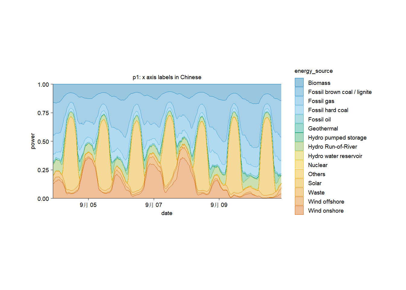
p1 <- energy_week |>
  tidyplot(x = date, y = power, color = energy_source) |>
  add_title(title = "p1: x axis labels in Chinese") |>
  add_areastack_relative() |>
  adjust_size(width = 100)

p1
能看出:x轴的labels含有“月”字。
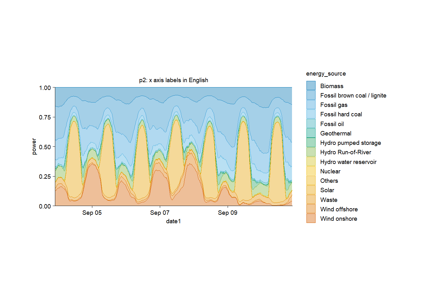
3. Change x axis labels to English
# Change date type to character
energy_week_char <- energy_week |>
  dplyr::mutate(date1 = as.character(date))

# View top 10 rows of columns involved
energy_week_char |>
  dplyr::select(date, date1, power, energy_source) |>
  dplyr::slice_head(n = 10)
# A tibble: 10 × 4
   date                date1                power energy_source
   <dttm>              <chr>                <dbl> <fct>
 1 2023-09-03 22:00:00 2023-09-03 22:00:00    0   Nuclear
 2 2023-09-03 22:00:00 2023-09-03 22:00:00 2634.  Hydro Run-of-River
 3 2023-09-03 22:00:00 2023-09-03 22:00:00 4711.  Biomass
 4 2023-09-03 22:00:00 2023-09-03 22:00:00 8399.  Fossil brown coal / lignite
 5 2023-09-03 22:00:00 2023-09-03 22:00:00 1726.  Fossil hard coal
 6 2023-09-03 22:00:00 2023-09-03 22:00:00  401.  Fossil oil
 7 2023-09-03 22:00:00 2023-09-03 22:00:00 4900.  Fossil gas
 8 2023-09-03 22:00:00 2023-09-03 22:00:00   17.9 Geothermal
 9 2023-09-03 22:00:00 2023-09-03 22:00:00  232.  Hydro water reservoir
10 2023-09-03 22:00:00 2023-09-03 22:00:00  586   Hydro pumped storage
p2 <- energy_week_char |>
  tidyplot(x = date1, y = power, color = energy_source) |>
  add_title(title = "p2: x axis labels in English") |>
  add_areastack_relative() |>
  adjust_size(width = 100) |>
  adjust_x_axis(
    breaks = c("2023-09-05", "2023-09-07", "2023-09-09"),
    labels = c("Sep 05", "Sep 07", "Sep 09"))

p2
给我买杯茶🍵